Since conditional formatting was released for Power BI, I have seen countless examples of bar charts that have a gradient color fill. If you aren’t careful about the gradient colors (maybe you just used the default colors), you will end up with poor color contrast. Luckily there are a couple of quick (less than 30 seconds for most people to implement) fixes that can improve your color contrast.
Check out this video to get a more detailed explanation of the problem and potential solutions.
Meagan’s 10-minute video on color contrast issues with gradient color fill in Power BI bar charts shows how to identify and resolve the color contrast issues
If you aren’t the type to watch a longer video, here are my tips:
If you are using the same measure for both the gradient and the bar length, consider whether you even need to have the gradient coloring. It’s not adding information.
If you do need/want the gradient, either because you are encoding a different measure or you just can’t bear to part with it, consider adding a border around the individual bars. Make sure the color contrast from the background and bar colors meet the desired color contrast ratio (usually 3:1).
This week, I was working with a client who requested I use the Segoe UI font in their Power BI report. The report contained a mix of core visuals and Deneb visuals. I changed the fonts on the visuals to Segoe UI and published the report. But my client reported back that they were seeing serif fonts in some visuals. I couldn’t replicate this on my machine while viewing the report in a web browser or in Power BI Desktop.
After a bit of investigating, it was determined that the issue only occurred inside Deneb visuals when viewed in a browser on a Mac. I reached out to Daniel Marsh-Patrick, maker of the Deneb custom visual, to see if he had a solution. He suggested that “Segoe UI” may not be a sufficient name for the font outside of Windows and that I could add some fallback fonts in my font properties. A fallback font is a font face that is used when the primary font face is not available when a page is loaded.
Segoe UI is not a font that is natively available on Mac OS. It is available in the font library for Office on Mac OS, but that doesn’t help when viewing a report in a web browser.
So, I updated the configuration in my Deneb visuals. Anywhere that I had defined the font, titleFont, or labelFont properties, I changed the value from "Segoe UI" to: "Segoe UI, wf_segoe-ui_normal, helvetica, arial, sans-serif",. You can see what this looks like in my config settings below.
A portion of the config settings from a Deneb visual in Power BI with fallback fonts added
Lessons Learned
I learned two things from this:
Test the Power BI report on a Mac to ensure a consistent experience.
Make a habit of adding fallback fonts instead of specifying just one font.
I really enjoy the power and flexibility of the Deneb visual. But I’m definitely still learning about some of the nuances of using Vega-Lite such as the font issue above (which is handled by Power BI Desktop behind the scenes when we use core visuals).
I recently created a treemap in Power BI for a Workout Wednesday challenge. Originally, I had set out to make a different treemap, but I ran into some limitations with the visual. I ended up with the treemap below, which isn’t bad, but it made me realize that the treemap is in need of some improvements to make it really useful. So I decided to share my thoughts here.
A treemap built in Power BI
Performance
The treemap above takes a long time to render. I populated the treemap with one field in Category, one in Details, one in Values, and four fields in Tooltips. The fields all come from an imported dataset containing a single table with 239 rows. I’m running the latest version of Power BI Desktop (July 2023) on a machine with an Intel Core i9-11900H processor (8 cores/16 threads, 2.5 GHz clock speed) and 64 GB of RAM. This is likely more than the average Power BI Desktop user has available to them.
Changing the color of one category in the format pane consistently requires a wait time of about 14 seconds for me before the treemap finishes re-rendering.
If I use Performance Analyzer to capture this action, we can see the last category color change took 15463 milliseconds (15 seconds), and almost all of that time was spent on visual display.
The Power BI treemap took over 15 seconds to render
This seems to be related to the presence of the tooltip fields. If I remove all the tooltip fields, it takes between 1 and 2 seconds, which is much more acceptable.
Category Hierarchies and Drilldown
Power BI allows us to include multiple categories and the ability drill up/down though them. This is good because treemaps are really meant for large amounts of hierarchical data. If you drill down from the top level, it will concatenate the category names. For example, if my top level is sector and my second level is country, and I choose to expand all down one level in the hierarchy, I will see a value like “Technology United States”. While that is a good start, it would be great to include some kind of delimiter in there so it’s easier to read; e.g., “Technology | United States” or “Technology ↳ United States”. The other problem with drilldown and category labels is that they get truncated when they hit the edge of the category, and there is no way to have it wrap to a new line or even just make the text for that category smaller to fit without changing all category labels to be smaller.
Category names that don’t fit in the section of the treemap are truncated
The more important feature for me is to be able to see multiple levels of the category at once, instead of treating them like all one level when you drill down. In Power BI today, when you expand down through multiple levels of the category hierarchy, you just get more colors (1 color per combination of values in the categories). That gets messy pretty quickly. I want to be able to make something like Figure 1 in this blog post.
Part of what makes that tree map work is that there is more space/wider borders between the top-level categories. Currently, the Power BI treemap doesn’t provide me with any control over the borders around categories. I want to be able to make the border around categories thicker and change the color. The color is important for accessibility. I need to be able to create good contrast between the rectangle background color, the category border, and the visual background, so it’s clear where a category ends. Maybe that can be accomplished with border width alone, but being able to change colors would be nice.
It would also be great to be able to label the top-level category outside of the rectangles, as is shown in this treemap.
Details and Labels
The other big feature I think we need is better control over the detail labels. We recently (May 2023) got the ability to create measure-driven data labels in some visuals such as bar, column, and line charts. I’d like to see that added to treemaps as well. What’s currently missing from measure-driven data labels is the ability to add line breaks. I think line breaks would help with fitting information into the rectangles.
It would also be nice to be able to control the border color and width around the detail rectangles as well. Right now we can’t change the rectangle borders in the chart, and it can make the rectangles hard to see depending on the color used and the chart background color.
As with categories, it would be nice to be able to allow the detail labels size to grow/shrink with the size of the rectangle.
Colors
Currently, the Power BI treemap allows conditional formatting of colors only if you don’t have any fields in the Details field well. In my treemap, I wanted to see the individual stocks grouped by sector. The only way to accomplish that was to put the stock symbol in the Details. If I put both sector and stock symbol in the categories and expand all the categories down one level, I can see the sector title and the individual rectangles per stock, but the stocks are no longer grouped by sector. The stocks related to technology are not placed next to each other in the treemap. So while I can implement conditional formatting to color all technology stocks the same color, I lose the ability to locate all technology stocks together.
A Power BI treemap with sectory and stock symbol placed in categories and conditional formatting used to color all technology stocks the same color
The inability to use conditional formatting on treemap colors when I have a field in the Details also means I cannot use proximity/location to encode the category and use color to encode another attribute or measure. That is what is done in the finviz treemap: they group stocks by sector and use size to indicate market cap, but the color is used to indicate stock price change over time.
Other Visual Improvements
Right now, I think the the limitations of the treemap visual keep it from being really useful. But I am excited to see the visualization improvements to other core visuals become available after months (years?) of stagnation. If you’d like to learn more about the planned improvements for core visuals, you can check out this AMA with Miguel Myers (PM at Microsoft who has set a new vision for core visuals in Power BI). You may also want to keep an eye on the PBI Core Visuals posts on LinkedIn. These planned improvements are, in my opinion, rightfully a higher priority than fixing the treemap.
Once the more general improvements across visuals are made (some of which may effect the treemap along with other visuals) and the most commonly used visuals (line charts and bar charts) are updated, I hope to see some of my requested improvements to the treemap visual.
Share Your Thoughts
What would you add to my list of treemap improvements? Are there any other enhancements you’d like to see? Do you know any cool tricks or workarounds for treemaps? Please share your thoughts in the comments below.
Power BI report containing a column chart with small multiples that show custom labels on each column.
Notice the label on each column that shows the year and average game length in h:mm format.
These custom labels are available for any bar or column chart – small multiples are not required.
How to add custom labels
The setting for these labels is a little bit hidden. On my column chart, I went to Format Pane, located the Data labels section, and found the Values area. Under Values, there is a toggle for Custom label that must first be enabled before populating the Field below it.
You can drag any field in the fields list into the custom label field. It only accepts one field, so if you want to display multiple values, you’ll need to create a custom column to concatenate values. That is exactly what I did in my example report.
You can control the orientation and position of the labels (mine are set to horizontal and inside base). You can also format the label values and background.
For more formal enterprise Power BI development, many people have a checklist to ensure data acquisition and data modeling quality and performance. Fewer people have a checklist for their data visualization. I’d like to offer some ideas for quality checks on the visual design of your Power BI report. I’ll update this list as I get feedback or new ideas.
Checklist illustration by Manypixels Gallery on IconScout
The goal of my data visualization quality checklist is to ensure my report matches my intended message, audience, and navigation.
There are currently 4 sections to my PBI data viz quality check:
Message check
Squint test
Visual components check
Accessibility check
Message check
Can you explain the purpose/message of your report in a single sentence?
Can you explain how each visual on the page supports that purpose/message?
I use the term purpose more often when I have a report that supports more exploratory data viz, allowing users to filter and navigate to find their own meaning in their own decision contexts. Message is much easier to define in explanatory data viz, where I intend to communicate a (set of) conclusion(s). My purpose or message statement often involves defining my intended audience.
If you cannot define the purpose/message of your report page, your report may be unclear or unfocused. If you can’t identify how a visual supports the purpose/message, you may consider removing or changing the visual to improve clarity and usefulness.
Squint test
You can perform a squint test by taking a step back and squinting while viewing your report page. Alternatively, you can use a desktop application or browser add-in that blurs the page, simulating far sightedness. Looking at the blurry report page helps you evaluate the visual hierarchy.
What elements on the page stand out? Should they? Areas of high contrast in color or size stand out. People read larger things first.
Does the page seem balanced? Is there significantly more white space or more bright color on one side of the page?
Does the page background stand out more than the foreground?
When visually scanning an image-heavy page (which follows a Z-pattern in Western cultures), does the order of items on the page make sense? Did you position explanatory text before the chart that needs the explanation? If there are slicers, buttons, or other items that require interaction before reading the rest of the page, are they placed near the top left?
Is there enough space between the items on the page to keep the page from feeling overly busy? Is it easy to tell where one visual ends and another begins?
Visual components check
I have two levels of visual components checks: reviewing individual visuals and reviewing the visuals across a report page.
Individual visuals components check:
Do charts have descriptive, purposeful titles? If possible, state a conclusion in the title. Otherwise, make it very clear what people should expect to find in your charts so they can decide if it’s worth the effort to further analyze them.
Are chart backgrounds transparent or using low-saturation colors? We don’t want a background color standing out more than the data points in the chart.
Are bright colors reserved for highlighting items that need attention?
Are visual borders too dark or intense? If every chart has a border that contrasts highly from the background, it can take the focus away from the chart and impede the visual flow. We often don’t need to use borders at all because we can use whitespace for visual separation.
Does the chart use jargon or acronyms that are unfamiliar to your intended audience? Try to spell out words, add explanatory text, and/or include navigation links/buttons to a glossary to reduce the amount of effort it takes to understand the report.
Are colors used within and across the page easily distinguishable?
Are fonts used consistently, with only purposeful deviations?
If charts should be compared, are the axis scales set to facilitate a reasonable comparison?
Does the interactivity between elements on the page provide useful information?
Are visuals appropriately aligned? Misalignment can be distracting.
Accessibility Check
I have a more comprehensive accessibility checklist on my blog that I keep updated as new accessibility features and tools are released. Below are some important things you can check to ensure your report can be read by those with different visual, motor, and cognitive conditions.
Do text and visual components have sufficient color contrast (generally, 4.5:1 for text and 3:1 for graphical components)?
Is color used as the only means of conveying information?
Is tab order set on all non-decorative visuals in each page? Decorative items should be hidden in tab order.
Has alt text been added to all non-decorative items on the page?
Is key information only accessible through an interaction? If so, you may consider rearranging your visuals so they are pre-filtered to make the important conclusion more obvious.
If you try navigating your report with a keyboard, is the experience acceptable for keyboard-only users? Does accessing important information require too many key presses? Are there interactive actions that can’t be performed using a keyboard?
Do you have any video, audio, or animation that auto-plays or cannot be controlled by the report user?
I am a fan of the viridis color palettes available in python and R, so I decided to make Power BI theme files for each of the 4 color maps (viridis, inferno, magma, plasma). These color palettes are not only lovely to look at, they are colorblind/CVD friendly and perceptually uniform (or close to it).
The screenshots below show the colors you’ll get when you use my theme files.
Viridis
Viridis theme colors in Power BI
Plasma
Plasma theme colors in Power BI
Magma
Magma theme colors in Power BI
Inferno
Inferno theme colors in Power BI
I generated a palette of 10 colors and then dropped the darkest and lightest colors in an effort to try to help you get good color contrast without inadvertently highlighting a data point. I chose to use the second darkest color of the 8 as the first/main color, which should work well on light backgrounds.
You’ll also notice that I have set in the theme the minimum, center, and maximum colors for use in a diverging color palette. This diverging palette includes the darkest and lightest color in an effort to give you a wider scale.
Give the themes a try
If you don’t enjoy choosing colors and just want something that looks good, feel free to hop over to the Github project and download the JSON files. You can learn more about the method I used to choose the colors and my suggestions for usage in the project documentation.
If you do use the themes, feel free to let me know how they worked and if you have suggestions for improvements.
If you’ve visited the Tab order area of the Selection Pane in Power BI in the last couple of months, you might have noticed some new buttons.
Three new buttons for managing tab order in Power BI
The hover text on the first button says “Expand All”. This button is useful if you have grouped visuals. Groups are indicated by a carat to the left of the item in the tab order list.
Tab order for a report page containing one group
Selecting the Expand all button shows the individual objects within a group.
Tab order with the group expanded
The second button is the Collapse All button. It will collapse the groups so only the name of the group is shown and not the individual objects within the group.
The third button is a great new addition: Have tab order match visual order.
The option to have tab order match visual order is the third button under Tab order.
This button will set the tab order for the visuals on the page to sort ascending by Y and then X coordinates. Let’s look at an example.
I have a report page containing 7 textboxes.
The X,Y coordinates of each box are shown in the box. The original tab order is indicated by the numbers in the circle.
After clicking the button to have tab order match visual order, the tab order is changed shown below.
Tab order set with the top left visual being first and the bottom right visual being last
This is often the correct tab order that matches how we read the report visually. This little button can increase keyboard/screen reader accessibility in one second instead of taking a couple of minutes per page.
There will be times that this tab order will not be what you want. Some exceptions might be when you use visuals that have a different amount of space inside the visual container, so the containers are intentionally misaligned (according to the X,Y coordinates) in order for the content to appear visually aligned. Then you might need to customize your tab order a bit. Another exception might be if you have some buttons or links at the top right of the report page that you want a user to visit last (after the content of the report). In that case, you would customize your tab order to make the button last.
But the majority of the time, this option to make tab order match visual order is exactly what you need. I applaud the Power BI team for taking this step to make creating accessible reports a little easier.
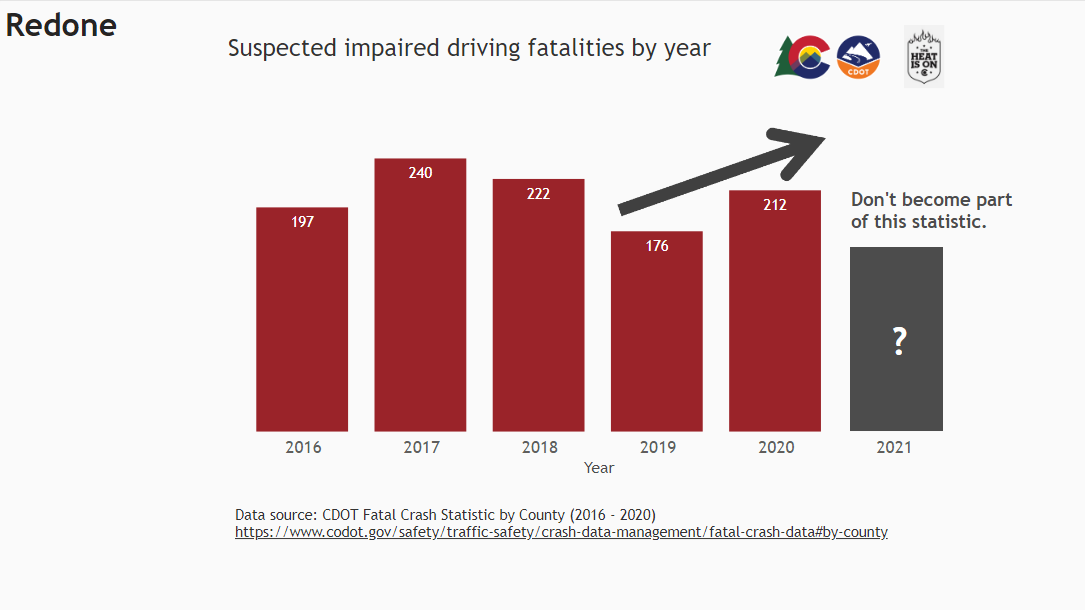
As I was browsing Twitter today, I noticed a tweet from the Colorado Department of Transportation about their anti-DUI campaign. Shown below, it contains a bar chart that appears to have been presented in PowerPoint.
— Colorado Department of Transportation (CDOT) (@ColoradoDOT) August 17, 2021
Tweet from CDOT containing a poorly designed bar chart
There are some easy opportunities to improve the readability of this chart, so I thought I would use it as an example of how small improvements can have a big impact on a fairly simple chart. I recreated the chart (as best I could) in Power BI and then made two revised versions.
My Power BI version of the original chartMy 10-minute makeover that increased readabilityMy additional iteration that applied a clearer message and focus
Especially when making data visualizations for the general public —and especially when you want to get people’s engagement on social media— you need to reduce perceived cognitive load. Otherwise, people won’t even bother to read your chart. If your chart feels too busy or too complicated, many people in your intended audience will feel it is not worth the effort to even try to read it and will move on down their Twitter feed to the next Anakin and Padme meme.
Watch the video below for all of the details.
21-minute video showing how to improve upon a bar chart found on Twitter using Power BI
Have you ever tried to use your browser to zoom in on a visual in a Power BI report? If you simply published your report and then zoomed in, you might have experienced something like the video below.
Trying to zoom in on a report that is set to Fit to page can be confusing for users.
With the default settings of the report, when you zoom in, only the menus around the report change. This is because of report responsiveness and the View setting. By default, reports are set to Fit to page. Power BI is refitting the report to the page every time you zoom.
Why would we need to zoom in?
There might be accessibility or compliance reasons to allow people to zoom in. For instance, WCAG 2.1 Success Criterion 1.4.4 states “Except for captions and images of text, text can be resized without assistive technology up to 200 percent without loss of content or functionality.” People with low vision or other vision impairments might benefit from the ability to zoom within a report page.
Another reason might be that a user simply wants to focus on one chart at a time. Power BI does have a Focus mode. Unfortunately, it currently does a poor job of increasing the font sizes on the visual that is in focus, often rendering it unhelpful.
Power BI visual shown in Focus Mode
Edit: A helpful commenter pointed out that you can zoom in and out while in Focus mode. This works pretty well on many (but not all) visuals.
What Are Our Other Options?
There are a couple of workarounds for users who need to zoom in on visuals.
We can set the report view — or teach users to set the report view — to Actual size. This then allows the browser zoom to work as anticipated. We probably don’t want to set all our reports to actual size because we would lose valuable screen real estate and diminish the experience for some users who don’t need to zoom. Having the report automatically fit to the user’s screen is usually helpful. But if users can change that setting as they need too, that might be ok. Here’s an example of how that works.
Setting the view on the Power BI report to Actual size allows users to zoom with the browser
2. We can use assistive technology to zoom. Both Windows and MacOS have built-in magnifier functionality. The downside to this is that using it would not satisfy WCAG 2.1 Success Criterion 1.4.4. I think there is still some gray area/lack of expertise as far as how people are making data visualizations WCAG compliant because it’s part text and part image/shape (although it’s not rendered on the page as an image in Power BI). I’m usually more concerned that users get the information they need an have a good experience. But I want to note this in case you are trying to be WCAG compliant and might run into this issue. Here’s an example of using the magnifier in Windows. You can still use the interactivity in the report. And you can change the size of the magnification window and the level of magnification.
The Windows Magnifier allows users to zoom in to part of the report page while retaining interactivity
3. Zooming in on the report page with a touch screen works fine. If users have tablets or laptops with a touch screen, they can use their fingers to zoom and it will behave as expected. Here’s a video that shows that experience.
Those are all the workarounds I’m aware of, but I’m interested to hear how you have worked around this issue. If you have other suggestions please leave them in the comments.
Jon Schwabish over at PolicyViz has created great initiative called the One Chart at a Time Video Series. It’s an effort to expand readers’ graphic literacy through short videos explaining how to read and use different charts. Each video is from a different person in the data visualization industry. Participants include people I admire such as Andy Kirk, Ben Jones, and Cole Nussbaumer Knaflic. Jon releases a new video each weekday. The initiative started January 11 and will continue through mid-March.
In each video, the presenter answers 3 questions:
Can you please describe the graph?
Can you please describe any considerations chart makers need to take into account when creating this type of chart?
Can you please share an example of this chart you really like?
I was honored to be asked to participate and talk about waterfall charts. My video (episode 13) has been published! You can check it out below, but I highly recommend you check out all the previous episodes and stay tuned for future episodes.
Links to examples
My video contains a few examples of waterfall charts, and I want to make sure to give credit to these designers for their work here, in addition to noting them in my video.